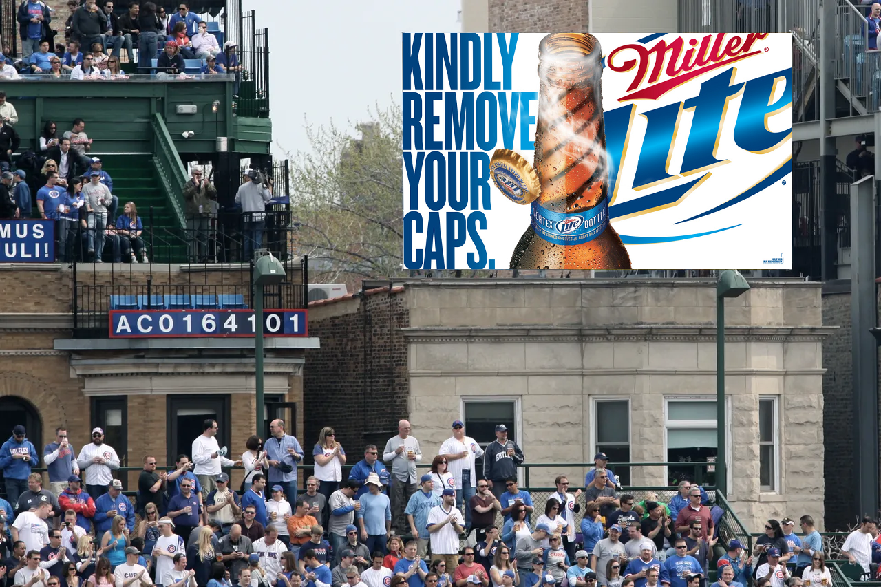
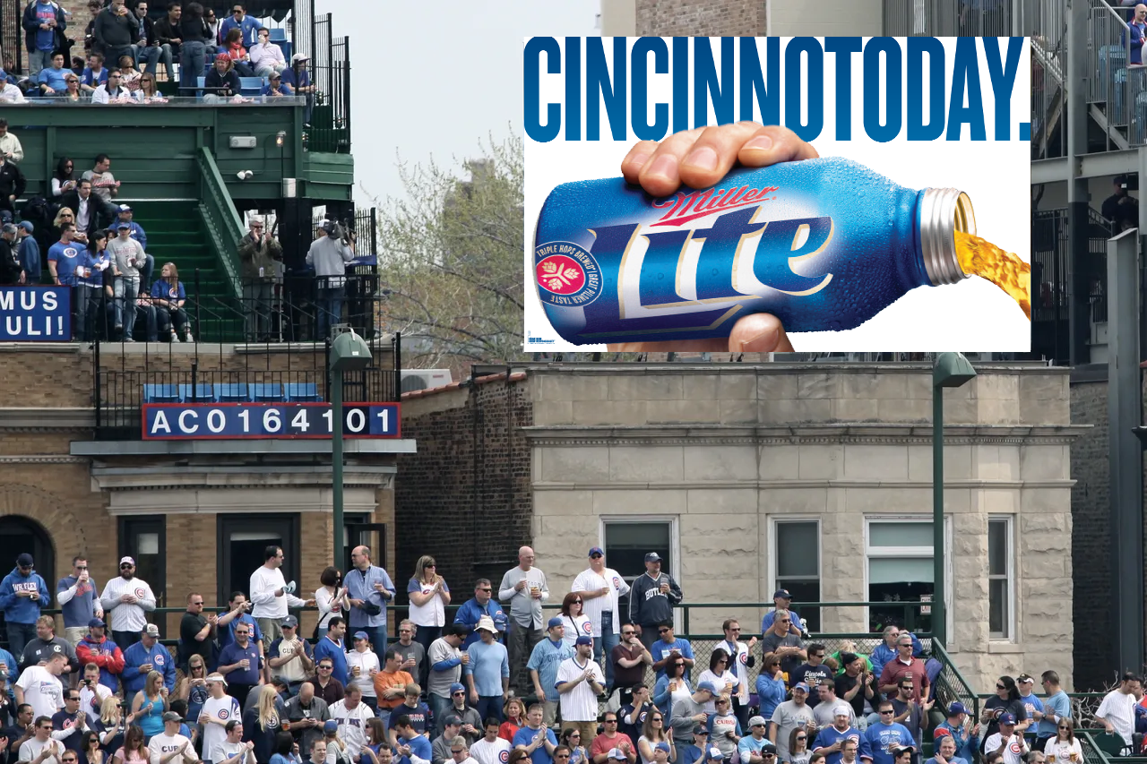
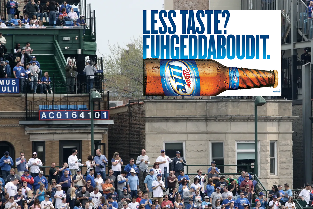
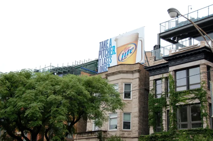
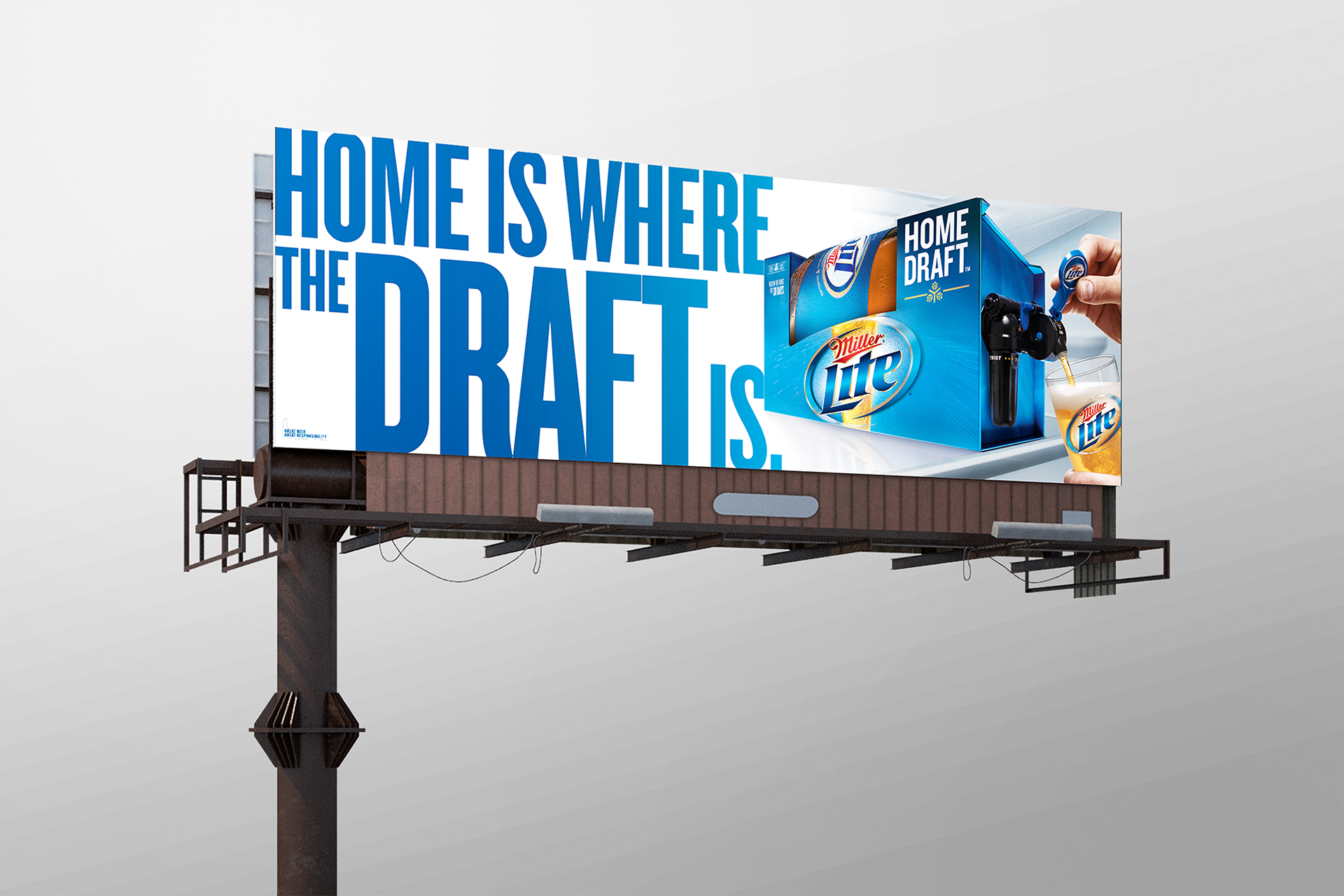
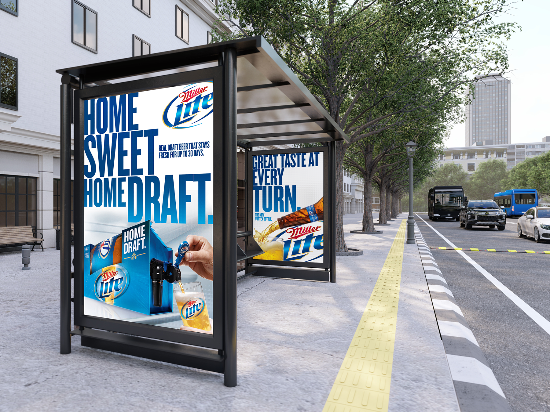
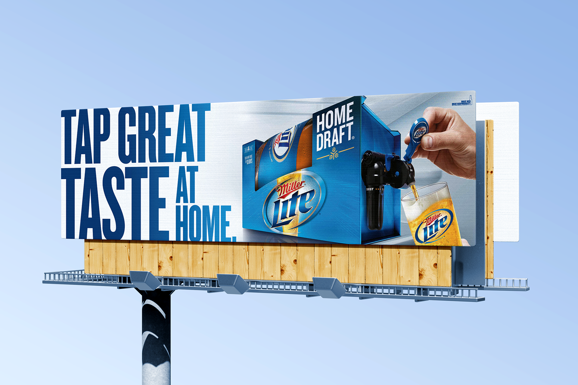
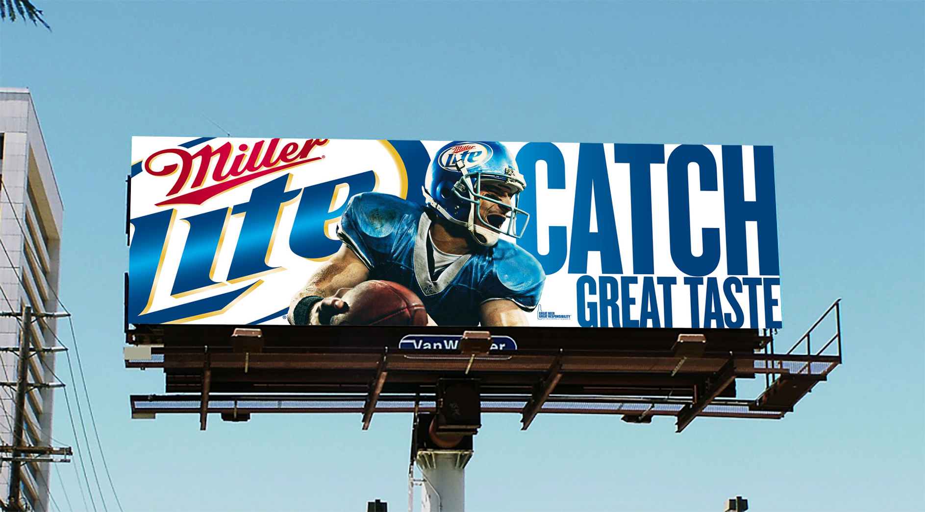
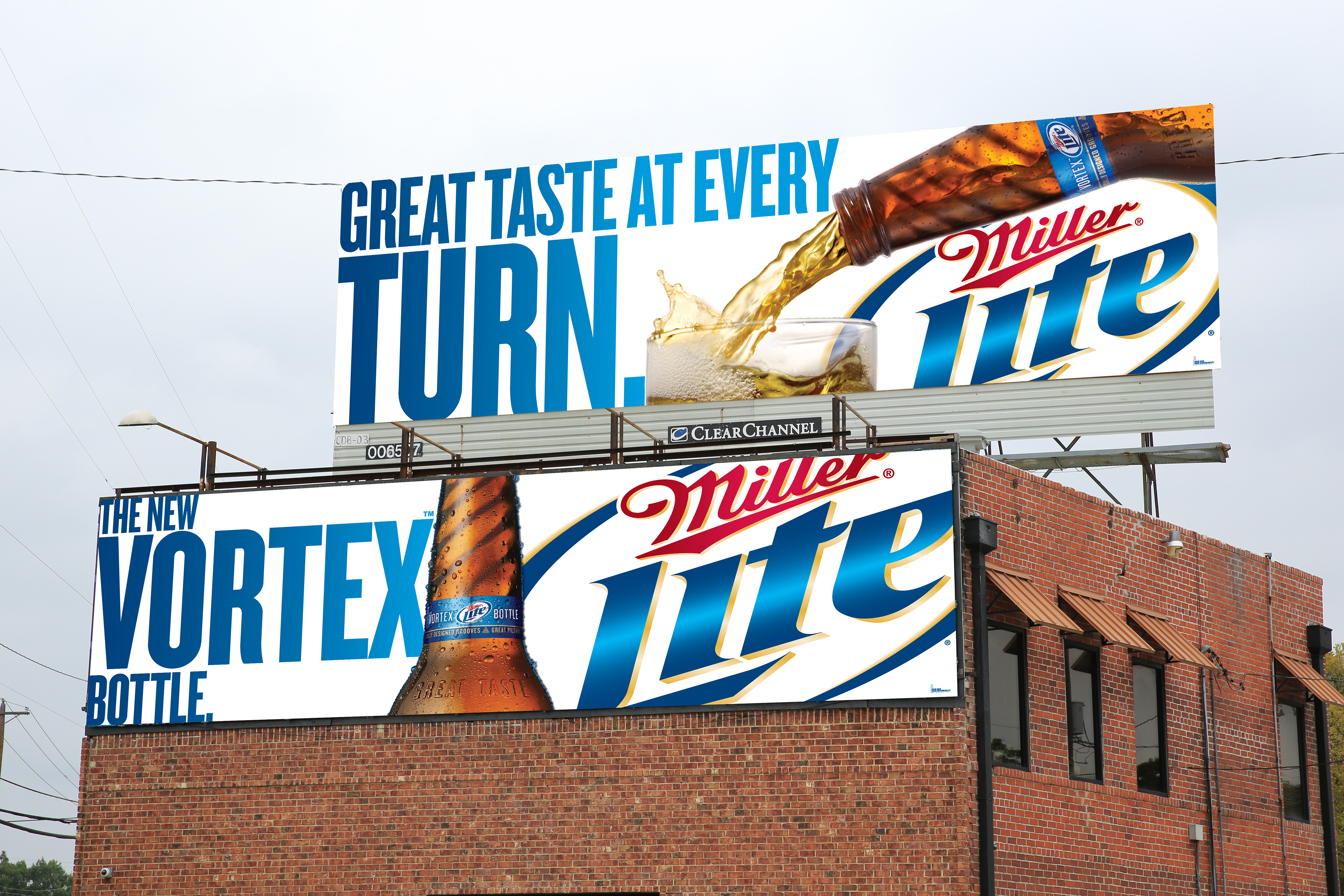
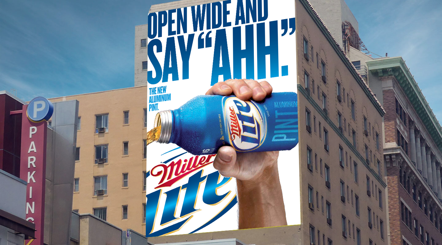
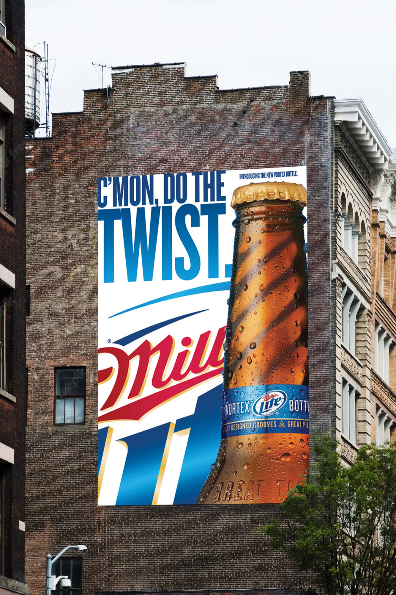
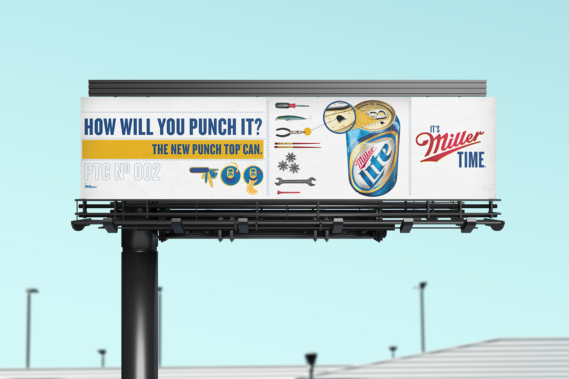
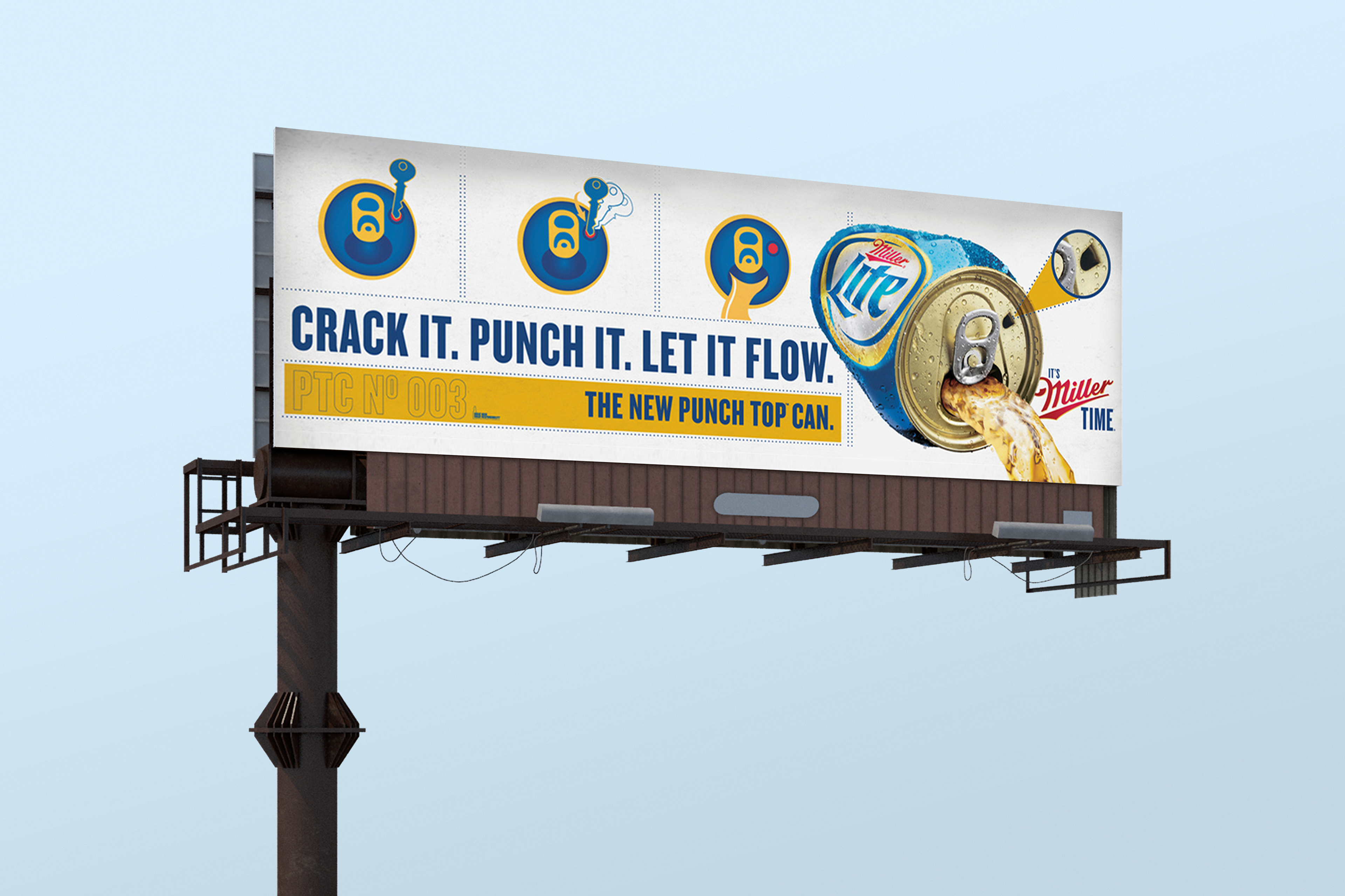
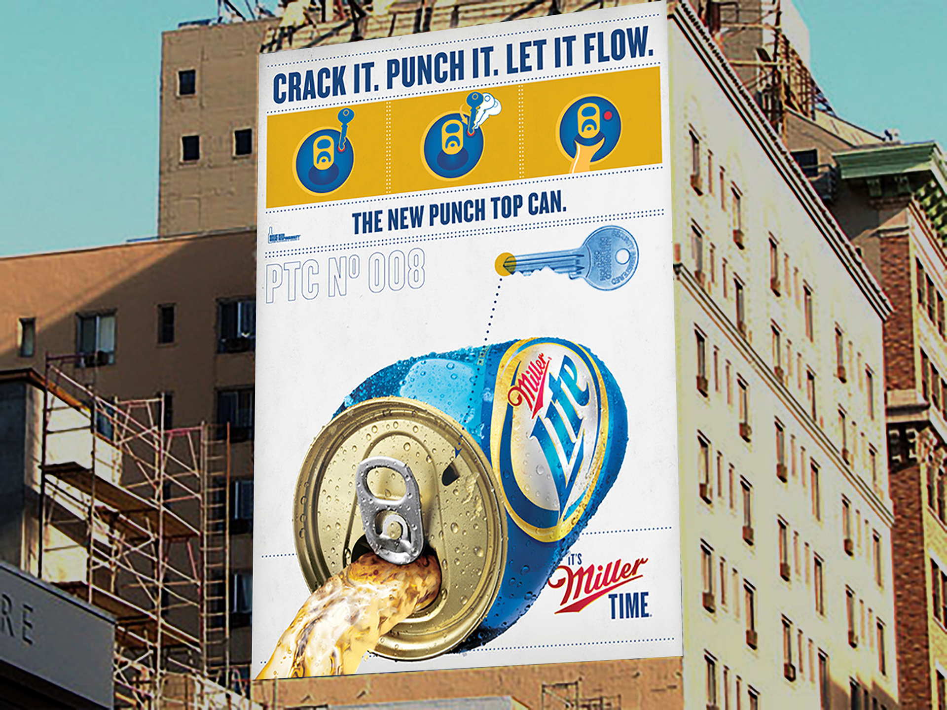
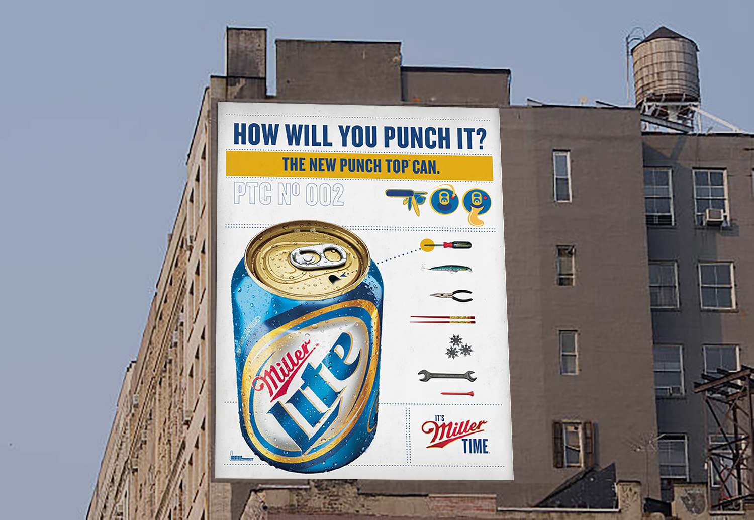
Miller Lite had a problem with their packaging standing out because it was so similar to it's main competitor and category leader, by far, Bud Light. By using a clean and simple white background, the visuals for Digital, Print, OOH and TV Mneumonics were designed to compliment the dark blue packaging and distance itself from Bud Light.
fcb
Art Direction, Design
All work is owned by respective clients and protected under copyright law.
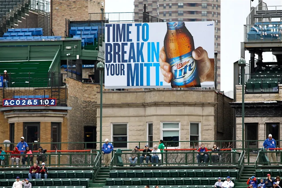
OOH Campaign
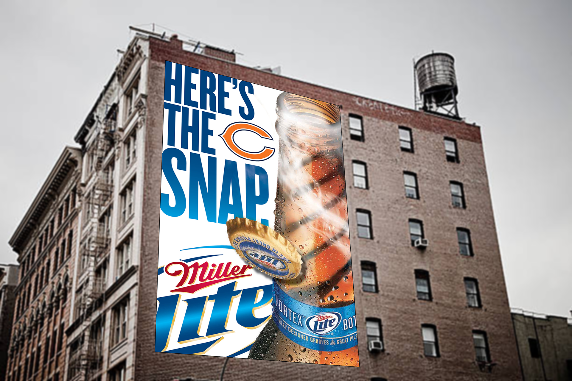
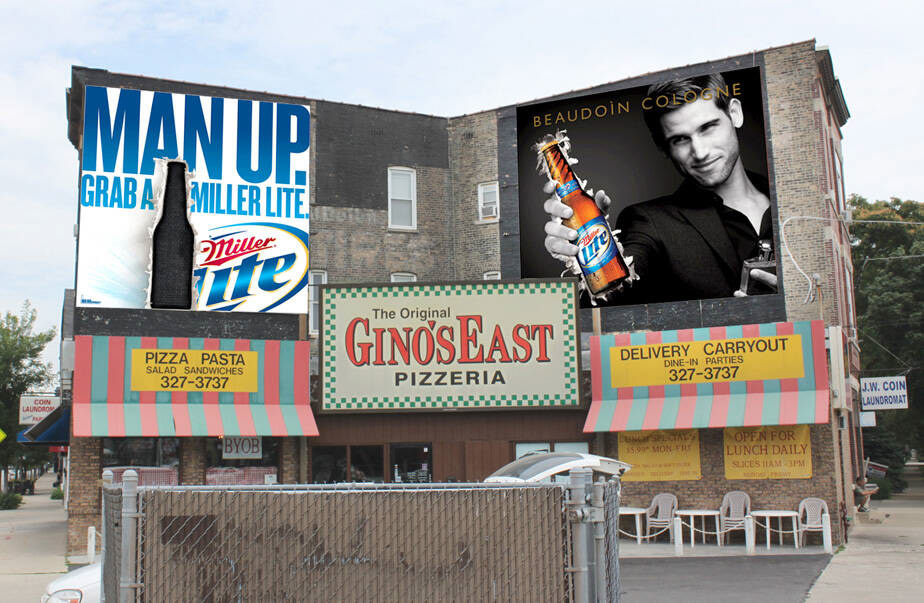
Wrigley Field
Billboards Changed Weekly with Messaging of Harassing Visiting Teams, Brand Awareness & Concerts